February 8, 2022
Investment Theory
Man Doth Not Invest by Earnings Yield Alone: A Fresh Look at Earnings Yield and Dynamic Asset Allocation
By Victor Haghani and James White 1
The Big Question
The most popular indicator of the attractiveness of the stock market – Shiller’s Cyclically-Adjusted Price Earnings ratio (CAPE) — is currently at 39x in the US, higher than it’s been 98% of the time for the past 120 years. What’s a thinking investor to make of this? Should he stay clear of the US stock market, or stick to some pre-set strategic allocation to equities, or is there something else going on? In this note, we’ll argue that CAPE is far from irrelevant, but on its own, it doesn’t tell an investor how much stock exposure to have.
Listen to Victor discuss this research on Bloomberg’s “What Goes Up?” podcast:
CAPE Basics
When the CAPE ratio is high, the prospective return of the stock market is low. This finding makes logical and intuitive sense, and is borne out in historical data. We can say something more specific and powerful: 1/CAPE is a pretty good, though imperfect, predictor of the inflation-adjusted return of the stock market.2 The measure of 1/CAPE is known as the Cyclically-Adjusted Earnings Yield (or just “Earnings Yield”), because it’s calculated as Earnings divided by Price. If you invest in the stock market when the Earnings Yield is 6%, your best expectation is that you’ll earn a long-term return (after inflation) of 6%. This is telling us that, contrary to popular belief, when Earnings Yield is low we shouldn’t expect to lose money from the Earnings Yield reverting to some average higher level, and vice versa. In other words, the predictive power of Earnings Yield over a long horizon is not improved by assuming that it is mean-reverting (For a deeper dive, see our 2017 article “Market Multiple Mean-Reversion: Red Light or Red Herring?”). The chart below illustrates this, using a horizon of ten years:
Chart 1: Next 10-Year Real Return vs. Earnings Yield at Start
US Equities, 1900 – 2021
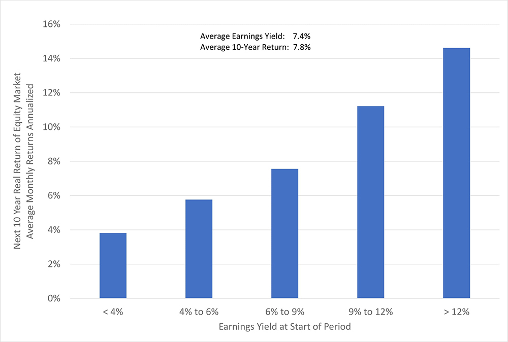
The first reaction of everyone who has seen this chart — your authors included — is: “Ooooeeee! Investor Hall of Fame, here I come!”
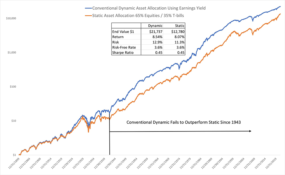
Alas, a backtest – as shown in the chart below – pours ice-cold water on these dreams: a simple dynamic approach based on Earnings Yield failed to deliver a higher Sharpe Ratio3 than a static allocation over the entire 120-year period for which we have data, and has actually under-performed since 1943.4 This result is one reason you will find so few investment products that offer a dynamic asset allocation strategy based on Earnings Yield or similar metrics. See Asness et al. “Market Timing: Sin a Little” (2017) for a lively and detailed description of the wellspring of this cold water.
Chart 2: Static vs. Conventional Dynamic Asset Allocation:
US Stocks and T-Bills, 1900 – 2021
Worth Another Look?
This result is puzzling though, because it just seems like basic common sense that it should be better to have more exposure when the market is offering higher expected returns, and we’ve seen that Earnings Yield has some power as an indicator of when to expect those higher returns.
The rest of this note is devoted to exploring an alternative, more internally consistent approach to dynamic asset allocation using Earnings Yield as the driver, which has historically delivered the improved performance we’d expect.
When Occam’s Razor Shaves Too Close
The historical analysis of the use of Earnings Yield to dynamically allocate between US stocks and US T-bills presented in Chart 2 is done in Occam’s spirit of maximum simplicity. The rule sets the equity allocation to:
- Be proportional to the Earnings Yield at each point in time,
- Average 65% over the whole sample, the same as for the benchmark Static Strategy, and
- Never be negative or in excess of 100% (i.e. no shorting and no leverage).5
We’ll call this the “Conventional Dynamic Strategy.”
There are a number of problems with this approach, including:
- The asset allocation decision in this strategy is comparing the attractiveness of equities to the attractiveness of T-bills. However, Earnings Yield is not a predictor of the relative attractiveness of stocks versus T-bills; it is only a predictor of the future real return of equities.6
- Changes in riskiness of the stock market are ignored. It is intuitive that all else equal, an investor would want to have less allocated to equities when they are expected to be more volatile.
- For the equity allocation to average 65% over the period requires knowing what the Earnings Yield of the stock market was over the whole sample, which a non-clairvoyant investor who wanted to follow this strategy could not have known.
A More Consistent Asset Allocation Rule Based on Excess Earnings Yield
If we want to use Earnings Yield to decide how much to invest in the stock market, to be consistent we also need to evaluate alternatives to stocks in terms of their expected real return. It seems natural to turn to US Inflation-indexed bonds (TIPS) as the relevant low-risk alternative to stocks, since the yield on TIPS is a measure of their expected real return, and so provides a directly comparable measurement to the Earnings Yield of equities. Indeed, there are strong arguments that “the (inflation) indexed perpetuity is the riskless asset for a long-term investor, since it finances a constant consumption stream over time,” as suggested by Harvard professors Campbell and Viceira in “Who Should Buy Long-Term Bonds” (2001).7 For practical purposes, long-term TIPS are pretty close to the inflation-indexed perpetuity they suggest.
It seems more natural to think about the attractiveness of stocks relative to inflation-protected bonds, rather than just by considering the level of Earnings Yield in isolation. For example, if the Earnings Yield of the stock market were 4% and the real yield on TIPS were also 4%, why would we want to own any equities?8 Or for a historical illustration, consider that the Earnings Yield of the US stock market was about 2.7% at the end of 2000 and also at the end of 2021 – but the ten-year TIPS yield was 3.6% back in 2000 and -0.7% at the end of 2021. Would a rational investor choosing between equities and TIPS want to have the same exposure to equities at both points in time, just because the Earnings Yield was the same? We think most investors would agree that they should want to own more equities at the end of 2021 than 21 years earlier. And yet, the conventional analysis that uses the market’s Earnings Yield without reference to the real return offered by safe assets suggests owning the same amount of equities in both cases.
We propose three changes to the (disappointing) Conventional Dynamic Strategy presented in Chart 2, setting the allocation to equities at each point in time to be:
- Proportional to the excess of the stock market’s Earnings Yield above the real yield of inflation-protected bonds (US TIPS). We’ll refer to this measure as “Excess Earnings Yield.”
- Inversely proportional to the risk (measured as variance) of the stock market as might reasonably have been estimated by an investor at the point in time of the asset allocation decision.
- At the level a Utility-Maximizing investor, with a typical and stable degree of Constant Relative Risk-Aversion (CRRA), would choose based on the estimates of Excess Expected Return and Risk set out in 1 and 2 above.9 By constructing the allocation decision from first principles in this way, we address the problem in the Conventional Strategy of needing to know the average level of Earnings Yield over the whole period.
We will call this the “Excess Earnings Yield Dynamic Strategy.”
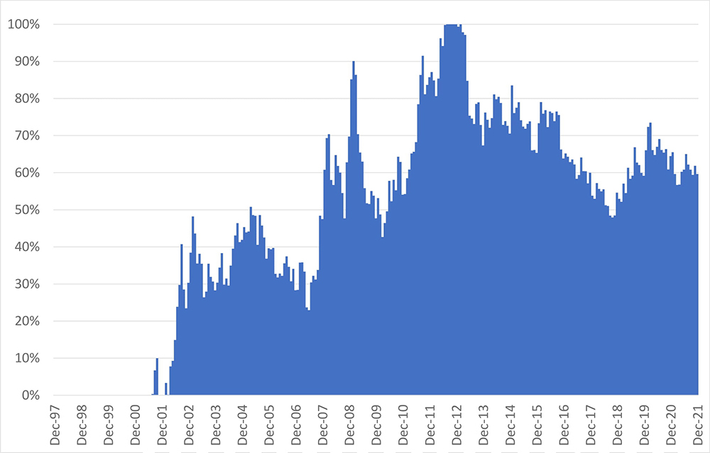
Determining exposure to equities as a function of expected excess return, risk, and investor risk-aversion to maximize Expected Utility under standard assumptions is known as the Merton Rule (see footnote 9). For this analysis, we’ll assume an investor with a degree of risk-aversion we found typical in a survey we conducted in 2018. This level of risk-aversion is such that an investor would choose to allocate 62.5% to equities if faced with an excess expected equity market return of 5% per annum, and equity riskiness of 20% per annum.10 The chart below shows the allocation to equities resulting from the Merton Rule, which we use in our historical analysis from the end of 1997 (the start of the TIPS market) to the end of 2021.11 In the first 3 1/2 years of the study, the desired allocation to equities was zero, because the Earnings Yield of the stock market was relatively low, TIPS yields were high, and therefore the Excess Earnings Yield was negative.
Chart 3: Allocation to US Equities Based on Merton Share vs. 10-Year TIPS
1997 – 2021
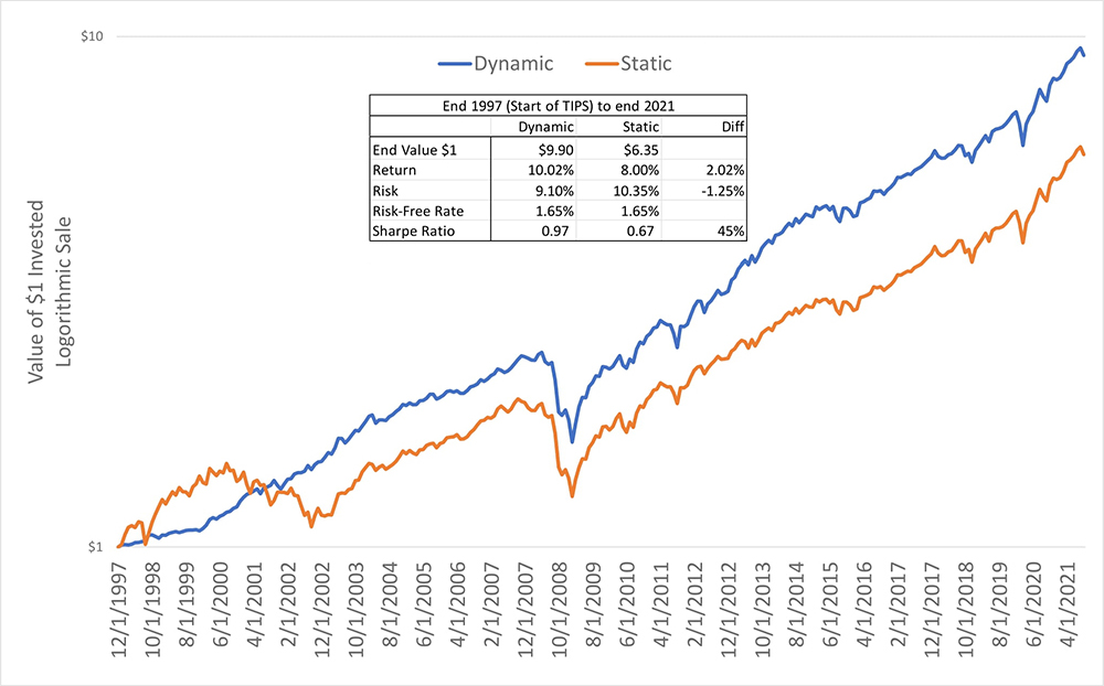
The chart below shows the performance that these allocations would have generated, compared to a static allocation of 65% in stocks and 35% in bonds (TIPS being the type of bond). The Excess Earnings Yield Dynamic Strategy performed much better, delivering a return about 2% pa higher than the Static Strategy, with lower risk and a nearly 50% higher Sharpe Ratio.12 By contrast, over the same period starting in 1997, the Conventional Dynamic Strategy illustrated in Chart 2 generated a return about 1.5% pa lower than the comparable Static Strategy but with roughly the same Sharpe Ratio. Of course, this is a very short window, and we certainly are not suggesting that you should follow this approach or avoid the conventional approach solely based on this back-test.
Chart 4: Excess Earnings Yield, Dynamic vs. Static Allocation
US Equities and 10-Year TIPS
1997-2021, Logarithmic Scale
It would be nice to see this analysis taken back further – unfortunately, the US Treasury has only been issuing TIPS since 1997. However, we do think it’s possible to construct a decent hypothetical history of long-term US real interest rates going all the way back to 1900, which we present in the chart below.13
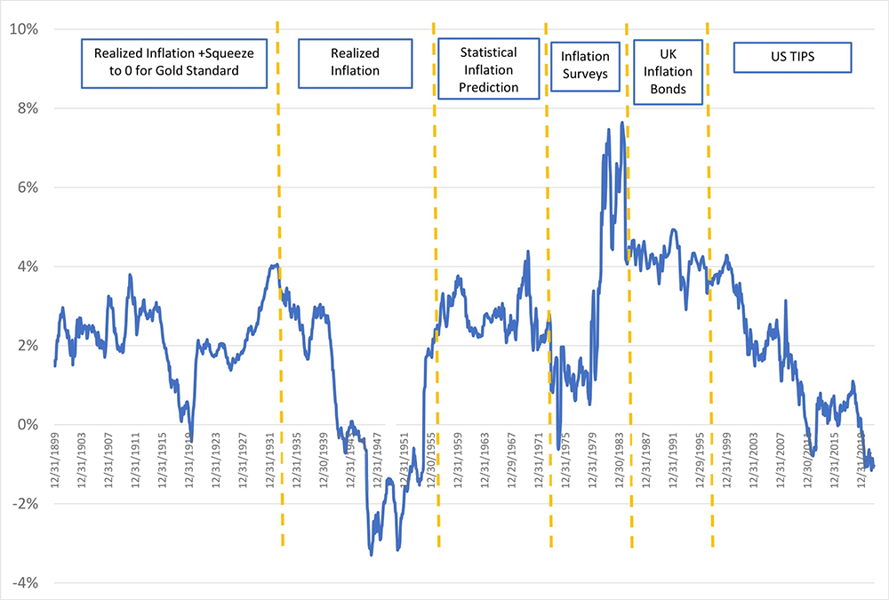
Chart 5: Ten-Year Real Yield Series
Actual & Hypothetical
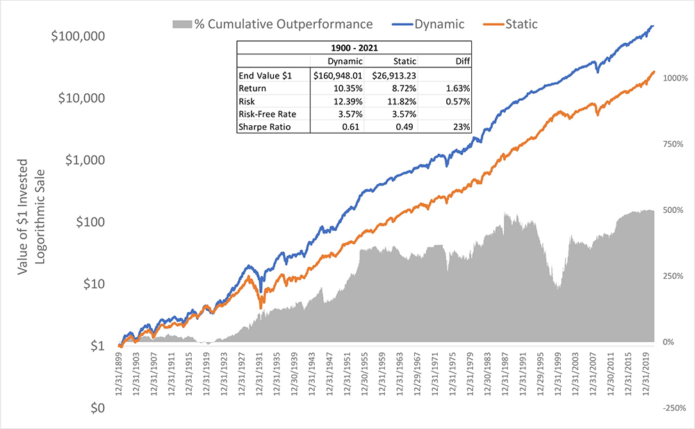
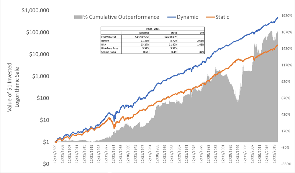
Using this hypothetical history of US real rates, we get the chart below, which shows the performance results back to 1900. Bottom line: the Excess Earnings Yield Dynamic Strategy did a lot better than a Static Strategy. Not only did the Excess Earnings Yield Dynamic Strategy do much better in terms of absolute return and quality of return than the 65/35 Static Strategy, but perhaps even more remarkable, it outperformed being 100% in US equities over the entire period, which generated a lower total return of 10.0% with 40% more risk.
Chart 6: Excess Earnings Yield, Dynamic vs. Static Allocation
US Equities and 10-Year TIPS
1900-2021, Logarithmic Scale
One more thing to consider is that it’s hard to say how an investor would have decided on a 65/35 stock/bond asset allocation to begin with, without use of some sort of framework, such as the Merton Rule, that put a price on risk. If an investor in 1900 were thinking about how much to invest in equities based on some other objective – such as maximizing Expected Wealth – he would have tried to invest the most that he could in equities with maximum leverage. Following such an approach, the investor would have likely gone bust in the 1929-1933 stock market meltdown of over 85%, and possibly in the several other greater-than-50% market declines experienced over this period.
In the Appendix, we provide details of all our assumptions and sources of data, and find that the Base-Case historical result just outlined is robust to changes in many of the assumptions. We also show the significant improvement delivered historically from including Time-Series Momentum as an additional indicator of the expected risk and/or the expected return of equities.
It’s Risk-Adjusted Returns That Matter
As pointed out earlier, the rule underlying the Conventional Dynamic Strategy presented in Chart 2 is focused solely on expected return, as it does not use the changing risk of the stock market as an input. If looking only at expected returns, then 100% in equities (or more if leverage is available) will always be the best allocation for any period where equities beat bonds. But intuitively, that can’t be right, as we need to make an adjustment for risk. Consider a situation where an investor expects equities to outperform TIPS by 2% pa, and given the meager expected excess return of equities, he decides to allocate just 25% of his portfolio to equities. Then, over the next ten years, equities do outperform TIPS by exactly the 2% per year he expected. An analysis not including risk would conclude that he’d have been better off with 100% in equities, because he’d have made more money after ten years with the higher allocation – but that is a flawed conclusion. He chose the 25% in equities because that allocation maximized his Expected Risk-Adjusted Return, and since the realized return was equal to the Expected Return, his decision should also be optimal ex post – which is to say that he would have experienced a lower Risk-Adjusted Return by holding a higher equity allocation.14
Improvement in Sharpe Ratio is a Twofer (Squared!)
Since 1900, the Excess Earnings Yield Dynamic Strategy has generated a Sharpe Ratio about 25% higher than that of the Static Strategy. Just how big a deal is a one-quarter increase in the Sharpe Ratio on one’s investment portfolio?15 A very big deal indeed! A one-quarter increase, whether it comes from a higher expected excess return or lower risk, delivers a compound benefit to an investor in that it:
- Provides a one-quarter higher return per unit of risk, and,
- It also increases the optimal allocation to equities by one-quarter, generating an additional one-quarter improvement.
So, a one-quarter increase in Sharpe Ratio generates roughly double that improvement (a 56% improvement, to be exact!) in the Risk-Adjusted Return of the investor’s portfolio.16 An improvement of this magnitude in expected Risk-Adjusted Return, compounded over the long-term horizons over which individuals typically save and invest for retirement, can make truly life-changing enhancements to investor outcomes.
Can Everyone Be a Dynamic Asset Allocator?
An Excess Earnings Yield Dynamic Strategy is not an approach that all investors can pursue at the same time. Economists would say that such a strategy is not macro-consistent. This is a pretty stringent test of an investment approach. Even a static asset allocation strategy that aims to keep a fixed fraction of wealth in equities would fall foul of this test. In fact, the only strategy that all investors can pursue at the same time is buy-and-hold at global market-cap weights. Whenever an investor is considering pursuing a strategy that not everyone can follow, he needs to have a good look in the mirror and ask why he is different from the average investor.17 An Excess Earnings Yield Dynamic Strategy is probably a good fit for long-term investors who expect their risk-aversion to remain steady through time, and who are willing and able to estimate expected real returns and risk offered by their investments.
Conclusion
We believe it’s never a good idea to adopt an investment strategy based primarily on historical simulations. However, when you believe a strategy makes sense a priori, it is worthwhile to challenge and update the strength of that belief with a look at the empirical evidence. Before looking at the historical record, we firmly believed it made intuitive sense to dynamically change one’s allocation to equities based on their expected return relative to the appropriate safe asset, and the empirical record reinforced that belief. It is time to correct the record regarding the efficacy of Dynamic Asset Allocation using the market’s Earnings Yield as a key input. And it is also time to differentiate this disciplined approach grounded in theory from the many seat-of-the-pants dynamic approaches that go under the pejorative heading of “Market Timing.” The magnitude of improvement in welfare that is available to investors who are willing and well-suited to vary their exposure to equities as their expected excess real return and risk change over time is too big to be left on the table.
Appendix
Data and Sources
| S&P 500 Stock Index Prices (1870 – 2021 monthly) | Standard and Poors, Online Data: Robert Shiller |
| S&P 500 Earnings and Dividends | Online Data: Robert Shiller |
| US T-Bill Rates | Online Data: Robert Shiller, St. Louis Federal Reserve |
| US Ten-Year Treasury Yield | St. Louis Federal Reserve, US Department of the Treasury |
| UK Ten-Year Inflation-Linked Bond Yield (1985-1997) | King and Low (2014) |
| US Ten-Year TIPS Yield (1997 – 2021) | St. Louis Federal Reserve, US Department of the Treasury |
| US CPI Inflation (1880 – 2021) | Online Data: Robert Shiller |
| Implied Inflation Forecasts (1955 – 1970) | Kozicki-Tinsley (2006), Ilmanen (2011) |
| Survey-based Inflation Forecasts (May 1970 – November 1984) | Philadelphia Fed, Cleveland Fed, Blue Chip Economic Indicators, Livingston Survey |
Construction of US Ten-Year TIPS Yields and Total Return Series from 1900 to 2021
From 1997 to 2021, we use Ten-Year TIPS yields directly. From 1985 to 1997, we use Ten-Year UK Inflation-Linked Bond yields. From 1900 to 1984, we use the US nominal Ten-Year bond yield minus an estimate for the ten years of US inflation, and we subtract a further 0.5% from the resultant real yield as a representation of a risk-premium that investors are likely to have demanded to bear inflation risk. The prospective inflation forecast we use from 1900 to 1984 is the average of survey data from 1970 to 1984, implied inflation forecasts from Kozicki-Tinsley (2006) from 1955 to 1970, a weighted average of realized 20-year, 10-year, 5-year and 1-year inflation with weights of 40%, 30%, 20% and 10% respectively from 1933 to 1955, and the weighted average of realized inflation itself averaged with 0 from 1900 to 1933 to represent some bounding of expectations at 0 inflation during the period the US was on the gold standard. Our approach to constructing this series owes a debt to Antti Ilmanen (2011).
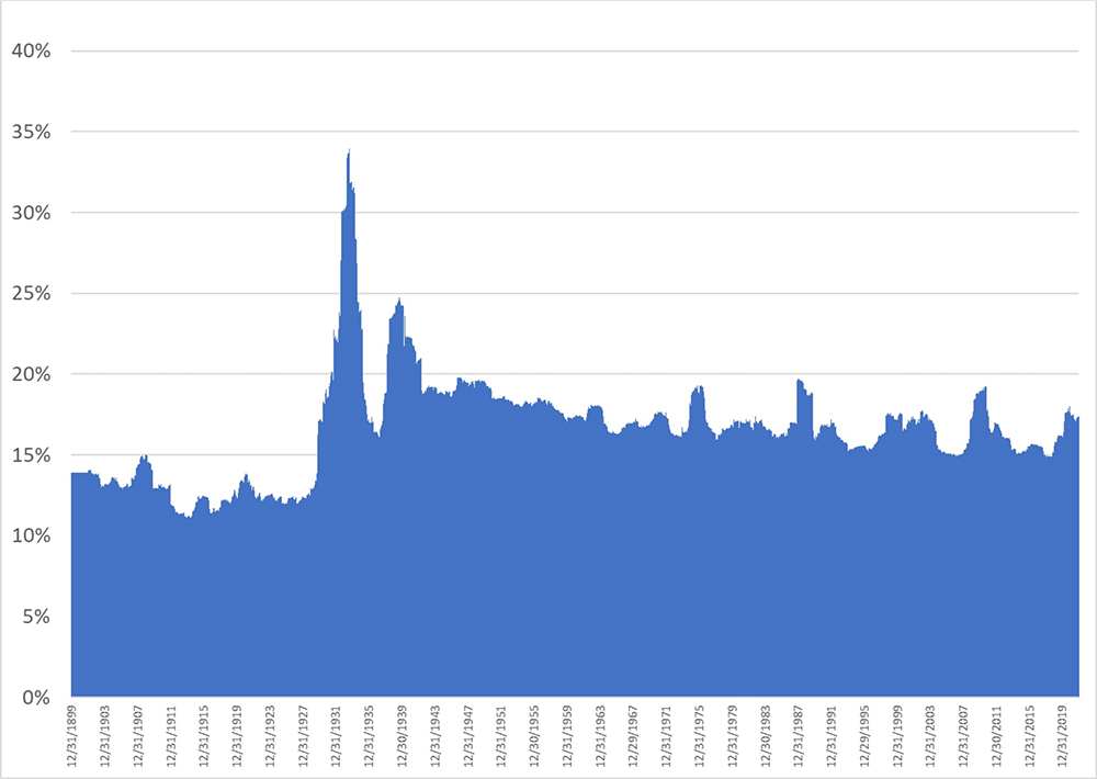
Construction of Equity Market Volatility Forecast 1900 – 2021
We calculate a series of rolling 10-year equity volatility and rolling 2-year equity volatility from monthly closing prices of the S&P500. We then take a weighted average of the life-to-date average of the rolling 10-year volatility and the most recent 2-year volatility. We put 75% and 25% weight on the 10-year and 2-year volatility measures, both expressed as variances, and then take the square root of that weighted average to arrive at the spot estimate of equity volatility that an investor might reasonably have used in deciding how much equity exposure to take using the Merton Rule. The chart below shows the volatility estimate we used in the historical simulation.
Chart 7: Equity Market Volatility Estimate Used in Historical Simulation
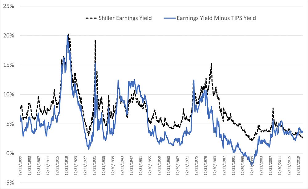
Shiller Cyclically-Adjusted Earnings Yield and Excess Earnings Yield Histories
Chart 8: Shiller Cyclically-Adjusted Earnings Yield
US, Dec. 1899 – Dec. 2021
Just a Good Draw?
We cannot say whether or not the past 120 years were just a favorable period of time for dynamic asset allocation. However, we can answer the question of how much better we would have expected dynamic asset allocation to perform given the range of expected excess returns equities offered at different times. To do this, we ran a simulation in which half the time, the excess expected return of equities was 1% and the other half of the time it was 9%, which roughly matched the spread of expected excess returns experienced in the past 120 years.18 We found that dynamically scaling the exposure to equities over many simulated histories delivered a roughly 30% average improvement in the Sharpe Ratio versus a static strategy. Against this backdrop, the historical experience of the past 120 years appears to be just a little bit worse than we’d have expected. The simulation also suggests that over a shorter horizon of 40 years, the dynamic asset allocation has an 85% probability of generating a higher return and a 65% chance of resulting in a higher Sharpe Ratio than a static weight strategy.
Robustness of Simulation Results to Different Assumptions
There are many other popular metrics used in dynamic asset allocation strategies, such as Tobin’s Q, Equity Market Value to GDP and Aggregate Investor Allocation to Equities (AIAE), to name a few. We prefer Earnings Yield because it directly gives an estimate for the long-term real return of the equity market, whereas all the other metrics need to be regressed against their historical averages in order to provide a return estimate. A survey-based forecast of future earnings may be better than using the past ten years of inflation-adjusted earnings as done in the Cyclically-Adjusted Earnings Yield, but we do not have that survey data going back very far and so could not run the historical simulation on that basis. Another metric, Cyclically-Adjusted Dividend yield plus dividend growth, closely relates to Earnings Yield and might be effectively used in conjunction with it, but this metric suffers from requiring an estimate of growth and being more sensitive to changes over time in corporate earnings payout policies.
We consider Time Series Momentum an indicator of prospective risk (it can also be thought of as a return indicator with much the same practical effect), which can be effectively used in combination with Earnings Yield to significantly improve risk-adjusted returns. We give results for the joint application of Excess Earnings Yield and Momentum in the table below, and also in the chart below.
We explored a range of different assumptions applied to the historical simulation. Below we describe each change in assumptions and the resultant Sharpe Ratio for the dynamic and static strategies over the entire period and the period since the introduction of inflation-protected bonds in 1985 in the UK.
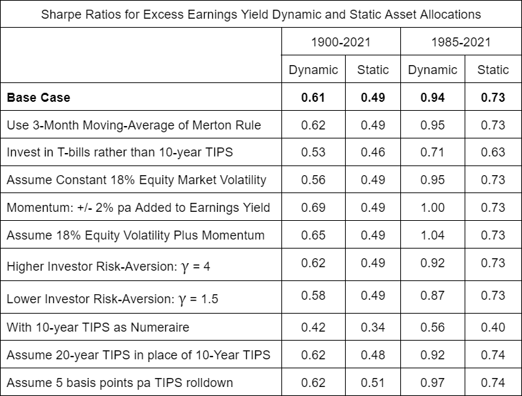
Chart 9: Excess Earnings Yield, Dynamic vs. Static Allocation
Using Momentum as Risk Proxy
US Equities and 10-Year TIPS
1900 – 2021, Logarithmic Scale
Decade by Decade Results
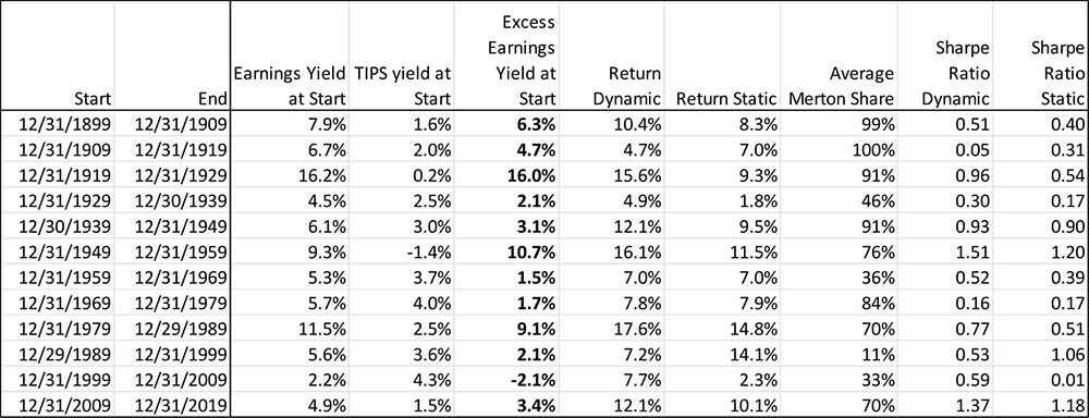
The Excess Earnings Yield Dynamic Strategy experienced a lower Sharpe ratio in 3 of the 12 decades examined.
Higher Turnover
A dynamic strategy is likely to experience higher turnover than a static strategy, and hence will incur higher transactions costs and possibly a higher tax cost as well. In our simulation with monthly rebalancing, the average turnover of the dynamic strategy was 29% per annum, versus 10% for the static weight strategy. Both of these turnover figures could be reduced by rebalancing less frequently and less fully to targets. Implementing a dynamic strategy is more complex and takes more of an investor’s attention, although on the other hand, a rules-based dynamic approach may be easier for an investor to stick with as it can scratch the investor’s itch to feel responsive in the face of a changing world.
If Expected Equity Returns Are Inversely Related to Changes in Market Level
By construction, when the market drops over a short period of time, the Cyclically-Adjusted Earnings Yield will go up, because Cyclically-Adjusted Earnings is based on the past ten years of earnings, which hardly changes from day to day. If an investor believes that the Expected Return of the stock market goes up when the market falls, then he should want a higher allocation to equities than suggested by the basic Merton Rule. This extra amount of equities was called “hedging demand” by Merton (1971), because it represents a hedge against the investment opportunity set faced by the investor. When the market goes down, the investor’s portfolio value goes down, but the increase in attractiveness of his investment opportunities offsets some of that loss in value, and so he can afford to own more equities. Pushing in the opposite direction of this hedging demand is the tendency for the market to be more volatile when it falls, which the market for options exhibits through the volatility “skew.” We view these phenomena as important, but not changing the basic conclusion that dynamic asset allocation driven by estimated expected return and risk is a sensible approach to investing.
As per the assumptions in the Merton Rule described above, risk-adjusted return is calculated by subtracting from the expected or realized excess return of a portfolio the cost of risk defined as:
γ (f σ)2 2
Where f is the fraction of the portfolio allocated to the risky asset, and γ and σ are as described in the Merton Rule above.
Further Reading and References:
- Asness, C., Moskowitz, T., and Pedersen, L. (2013). “Value and Momentum Everywhere.” Journal of Finance 68 (3): 929–985.
- Asness, C., Ilmanen, A., and Maloney, T. (2017). “Market Timing: Sin a Little.” Journal of Investment Management 15 (3): 23-40.
- Campbell, J. and Shiller, R. (1988). “Stock Prices, Earnings and Expected Dividends.” Journal of Finance 43 (3): 661-676.
- Campbell, J. and Viceira, L. (2001). “Who Should Buy Long-Term Bonds?” American Economic Review 91 (1): 99-127.
- Cochrane, J. (2022). “Portfolios for Long-Term Investors.” Review of Finance 26 (1): 1-42.
- Cochrane, J. (2011). “Presidential address: Discount rates.” Journal of Finance 66 (4): 1047–1108.
- Haghani, V. and White, J. (2018). “Measuring the Fabric of Felicity.” Elm Wealth.
- Haghani, V. and White, J. (2017). “What if High Stock Values Revert to Normal Levels?” Bloomberg.
- Haghani, V. and White, J. (2017). “What Our Market Return Forecasts Really Mean: Equity Convexity and Investment Sizing.” Elm Wealth.
- Haghani, V. and White, J. (2017). “Market Multiple Mean-Reversion: Red Light or Red Herring?” Elm Wealth.
- Haghani, V. and White, J. (2020). “Taking Stock.” Elm Wealth.
- Ilmanen, A. (2011) Expected Returns. London: Wiley.
- Keimling, N. (2016). “Predicting Stock Market Returns Using the Shiller CAPE — An Improvement Towards Traditional Value Indicators?” SSRN Electronic Journal.
- King, M. and Low, D. (2014) “Measuring the `World’ Real Interest Rate.” NBER Working Paper Series 19887. https://www.nber.org/papers/w19887
- Kozicki, S. and Tinsley, P. (2006). “Survey-Based Estimates of the Term Structure of Expected U.S. Inflation.” Bank of Canada Working Paper No. 2006-46.
- Merton, R. (1969). “Lifetime Portfolio Selection under Uncertainty: The Continuous-Time Case.” Review of Economics and Statistics 51 (3): 247-257.
- Merton, R. (1971). “Optimum Consumption and Portfolio Rules in a Continuous-Time Model.” Journal of Economic Theory 3 (4): 373-413.
- Merton, R. (1973). “An Intertemporal Capital Asset Pricing Model.” Econometrica 41 (5): 867-887.
- Micaletti, R. (2021) “Market Timing Using Aggregate Equity Allocation Signals.” Alpha Architect.
- Rintamaki, P. (2021) “Total Wealth Portfolio Compositioin and Stock Market Returns.” SSRN Electronic Journal.
- Samuelson, P. (1994). “The long-term case for equities.” Journal of Portfolio Management 21 (1): 15-24.
- Jivraj, F. and Shiller, R. (2018). “The Many Colours of CAPE.” Yale ICF Working Paper No. 2018-22.
- This not is not an offer or solicitation to invest, nor should this be construed in any way as tax advice. Past returns are not indicative of future performance.
- A variety of corporate-growth models can produce the result that real equity returns will be centered around the earnings yield. One basic condition under which real returns will equal the earnings yield would be if company earnings can grow with inflation with all earnings paid out currently to shareholders.
While these models are all caricatures of the real world in a variety of ways, they nonetheless provide a solid starting point for thinking about expected stock market returns and making sense of long-term historical data. For a more up-to-date evaluation of CAPE as a predictor of real equity returns, particularly assessed in non-US equity markets, see Keimling (2016). They conclude:“Existing research indicates that the cyclically adjusted Shiller CAPE has predicted long-term returns in the S&P500 since 1881 fairly reliably for periods of more than 10 years. Furthermore, the results of this paper indicate that this was also the case for 16 other international equity markets in the period from 1979 to 2015.”
- A measure of risk-adjusted return.
- Unless otherwise stated, all historical analyses presented in this note are exclusive of trading costs and taxes.
- The simplest asset allocation rule that meets these three requirements is: k* = min(9.7 * EY, 100%) , where k* is the allocation to equities, EY is the Earnings Yield of the stock market at the time of the asset allocation decision, and (1 – k*) will be the allocation to T-bills, and assuming EY > 0 at all times.
- Comparing Earnings Yield to the yield on T-bills also would not be consistent, as Earnings Yield is a real return estimate while the yield on T-bills is a nominal return estimate. Using Earnings Yield minus the T-bill rate as the asset allocation driver results in the same conclusion conveyed by Chart 2. A Dynamic Asset allocation rule based solely on the Earnings Yield of the stock market would make sense if the expected real return of T-bills was constant through time, but we know this is not the case.
- As Stanford economist John Cochrane further elaborates in “Portfolios for Long-Term Investors” (2021), “Their (Campbell and Viceira’s) proposition is obvious if you look at the payoffs. An (inflation) indexed perpetuity gives a perfectly steady stream of real income, which can finance a steady risk-free stream of consumption. It is the risk-free payoff stream.”
- This statement ignores taxes, which generally favors holding equities for taxable US investors. There are other reasons an investor may want to own some equities under these circumstances, such as to avoid putting 100% faith in the Earnings Yield metric, as a form of hedging demand as described in Merton (1971) or as a partial hedge of an affluent investor’s consumption basket.
- The formula we use is known as the Merton Rule and is:
f*
μ
γ σ 2
Where f* is the optimal fraction of the portfolio to allocate to equities, μ is the Excess Earnings Yield, γ represents the level of risk-aversion of the investor in CRRA Utility and σ is the expected volatility of equities. γ was set to 2 in the historical simulation, a round number representing an investor slightly more risk tolerant than the average of those surveyed by Haghani and White (2018).
- Using the Merton Rule with γ = 2 we get: k* = 62.5% = 5% / (2 * 20%2) .
- We assume that the Earnings Yield is an indicator of the real Arithmetic return of equities, although there is a good argument that Earnings Yield is predicting the real Geometric return. See Haghani and White, “What Our Market Return Forecasts Really Mean: Equity Convexity and Investment Sizing,” (2017). We constrain the allocation to equities to be between 0% and 100%, i.e. no shorting, no leverage. Relaxing the no-shorting and no-leverage constraints does not change the results materially.
- In calculating the Sharpe Ratio, we are adding .5 * StDev2 to the Geometric realized return to convert to an Arithmetic return to use in the numerator of the ratio.
- Of particular note is the decade following WWII, during which we estimate ten-year TIPS would have traded at an average yield of -1.5%. During this period, the ten-year nominal Treasury bond yield averaged 2.5% and inflation ran at about 5%, touching 20% in the years directly following the end of the war.
- Also assuming his risk assumptions were realized.
- A long-term investor may choose to measure risk in terms of the long-term real annuity value of his wealth – for example, using a perpetual inflation-protected bond as his numeraire. See Appendix for Sharpe Ratio of the Excess Earnings Yield Dynamic Strategy with returns measured relative to 10-year TIPS, which also shows a roughly one-quarter improvement versus a static strategy.
- The improvement is (5/4)2 – 1 = 9/16 = 56% .
- See John Cochrane’s “Portfolios for Long-Term Investors” (2021), pp 19-20 for a deeper discussion of the “Average Investor” theorem and the “Look-in-the-Mirror” test.
- Assumptions: γ = 2, σ = 20%, annual rebalancing.