March 19, 2020
How Elm Works
Taking Stock
By James White and Victor Haghani 1
The longest bull market in US stock market history is over. Uncertainty over the public health and economic impact of the coronavirus pandemic will keep markets extremely volatile, making it likely we’ll touch a wide range of price levels in the months ahead.2 Amidst such uncertainty, it’s a particularly good time to take stock of long-term return prospects. In doing so, we’ll present an often-overlooked perspective on the market’s attractiveness which is both intuitive and technically sound. We hope long-term investors will find it useful in deciding how much stock market exposure they want right now, and at other levels the market may visit in the future.
One popular way of thinking about equities is that they have an ‘average’ or ‘fair’ earnings multiple to which they tend to revert, making them cheap below that multiple and expensive above it. We don’t subscribe to this view, as we discuss in our note “Market-Multiple Mean-Reversion: Red Light or Red Herring?” But we do think there are times when it makes sense to own a lot of equities, because they offer high expected returns relative to other places you can put your money, and other times when relative expected returns warrant a small equity allocation. This perspective requires two measures: 1) a forecast for the expected return of the equity market, and 2) an appropriate ‘benchmark’ investment against which to measure equities’ relative attractiveness.
Getting Real
The most widely used forward-looking indicator of the stock market’s long-term expected return is the Cyclically-Adjusted Earnings Yield (i.e. 1/CAPE).3 Importantly, it’s a forecast for what economists call the “real” return of equities, which means the return in excess of inflation. Increasing our wealth in real terms improves our well-being, increasing it in nominal terms alone does not.
Next, we need to identify the appropriate benchmark investment against which to measure equities’ relative attractiveness. Owning equities is risky, and so it’s pretty intuitive to measure the expected return on equities relative to the return offered by a risk-free asset.4 We probably wouldn’t want to own any of a risky investment with a 10% expected return if the risk-free rate was also 10% – why take extra risk for no extra return? The same investment with a 5% expected return and 0% risk-free rate might look great. It’s the excess return – often called the equity risk premium – we should care about when thinking about the attractiveness of equities.5
Our return forecast for equities is both long-term and real, and so the appropriate benchmark for the risk-free rate also needs to be long-term and real. Most suited to this role is the yield on long-term US Treasury Inflation Protected Securities (TIPS).6
Fifty-Year Historical Perspective on Equity Market Risk Premium
Taking the difference between the long-term expected real return of equities and the real risk-free rate gives us the Equity Risk Premium chart below. It offers our preferred perspective on the current and historical attractiveness of US and Global (US plus non-US) stock markets for long-term investors who do not hold strong near-term views. The chart ends on March 18th, 2020.
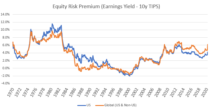
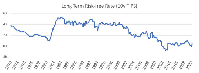
One reason you may not have seen a chart like the one above before is that the US Treasury only began issuing TIPS in 1999. To produce this chart, we had to construct a proxy series for the long-term risk-free real rate from 1970 – 1999, inferring what the long-term TIPS rate would likely have been had it existed, which can be seen in the lower panel of the chart.7
We see periods of generous equity risk premia (1975 – 1982), and also periods of low and even negative risk premia (1987 – 2002). An investor looking at CAPE alone might find US equities relatively unattractive right now: the current CAPE of 22.5x8 is higher (less attractive) than it’s been 80% of the time over the past 120 years. We think the chart above paints a very different picture, suggesting that today’s US and global stock market risk premia are attractive, in both absolute and historical terms. For example, the current global equity risk premium of about 6%9 is higher (more attractive) than it’s been 80% of the time since 1970, and it’s higher now than it was during the entire period from 1985 up to the financial crisis in 2008. While equity risk premia cannot tell us the future path of equity prices, especially in the short-term, they do suggest that current long-term return prospects for global equities are attractive and consistent with an above-average level of exposure.10
The History of Real Rates
Risk premia and real rates have both had a wild ride over the period shown in the chart above. One distinctive feature of this chart is that real rates are really low right now. This flies in the face of classical economic theories of interest rates that posit positive real interest rates are necessary to induce people to save for the future, rather than consuming “too much” in the present.
It’s surprisingly hard to find deep historical context, beyond living memory, to inform thinking about real rates. The reference work on the long-term, 2,000-year history of interest rates, Sydney Homer’s “A History of Interest Rates,” mentions real interest rates just once in 700 pages. This isn’t especially unusual; in the financial press it’s much more common to read about nominal rates, and investment returns are nearly always quoted in nominal terms. Market-quoted real-return instruments such as US TIPS and UK Linkers are still in early middle age, and have not really penetrated the popular consciousness yet.
However, a 2019 paper by Yale economic-historian Paul Schmelzing, “Eight Centuries of Global Real Interest Rates,” has shed valuable light on the history of real rates. Here we reproduce a chart from the paper showing the core findings:
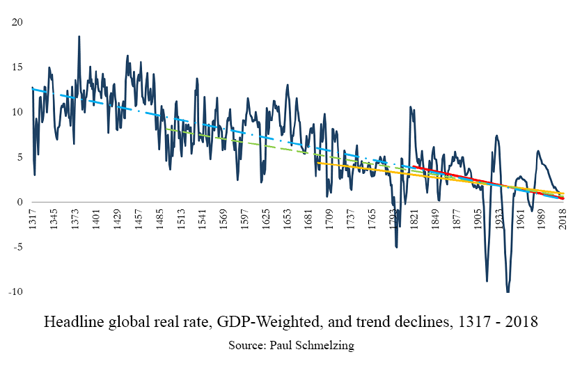
A few takeaways from this chart:
- Periods of negative real interest rates, such as much of the developed world is currently experiencing, are relatively common and can be protracted. While negative nominal interest rates historically have been difficult to impose on investors who have the option of keeping cash “under the mattress” rather than in a bank, negative real rates don’t run up against any such hard barrier.
- There does not appear to be an average or “natural” level of real interest rates around which actual rates fluctuate.
- There appears to be a downward trend in the level of real rates, estimated at 2bp / year. However, we caution that this trend-line does not have strong predictive power.
Technical Sidebar
We see nothing in the historical data which makes us disagree with the market’s current expectation of near-zero real rates – but what should an investor (we’ll call her Tipper) do who doesn’t share that view, believing instead that risk-free real rates will rise and TIPS prices will fall? A full treatment of this question merits its own note, but for a sense of how one might approach it consider a simplified world with three available investments: TIPS, the stock market and T-Bills, with TIPS being the minimum-risk asset for Tipper, an investor with a long-term horizon.11 Tipper has her equity return forecast, expressed relative to TIPS as we’ve been discussing, and because she thinks TIPS prices will fall, she’s also forecasting a high return for T-Bills relative to TIPS. She now needs to decide the optimal combination of equities and T-Bills to hold, based upon their expected excess return relative to TIPS, their risk and their correlation to each other. If we assume that they are uncorrelated, as suggested by both data and a desire for simplicity, then we can determine the optimal allocation to each of the trades separately, driven by their own expected return and risk relative to TIPS and Tipper’s personal level of risk aversion.12 In this case, Tipper’s desired equity exposure is still driven solely by their expected return relative to TIPS. Her real rate view makes her want to hold more T-Bills, not less equities, and if her desired equities plus T-Bills exposure is greater than 100% she’ll need to have a negative (short) allocation to TIPS to bring the sum of the allocation weights to 100%. If however she can’t or won’t short TIPS (and we too are generally opposed to shorting any asset), then she wouldn’t be able to hold all the equities and T-Bills she wants and would optimally reduce both her desired equity and T-bill exposures instead.
Conclusion
For an investor who accepts as fair the market real rate offered by TIPS, should the absolute level of real rates impact the equity allocation decision? All else equal, our answer is no. Lower risk-free rates imply lower absolute expected returns for risk-free and risky assets. This is an unfortunate fact for any investor, but in deciding how much to invest in equities, investors should want to scale risky investments proportionally to the risk premium, not the absolute expected real return. Of course, ‘all else equal’ is just the starting point for a fuller assessment. For example, lower real rates means more of the value in equities comes from longer-dated cash-flows, which may increase the long-term riskiness of equities and impact how much an investor should want to own for a given level of expected excess return. And of course, investors taking a long-term view of equity market attractiveness will still want to make adjustments for identifiable near-term impacts to earnings streams, such as those arising from the current coronavirus pandemic.
We hope the framework presented in this note gives you a fresh perspective for evaluating the attractiveness of the broad stock market to a long-term horizon. Indeed, if we accept that today’s low real rates represent a fair expectation of the future, P/E ratios which seem otherwise elevated may join low and negative interest rates as part of the ‘new normal’ investing landscape.
Further Reading and References
- Campbell, John, and Robert Shiller. “Stock Prices, Earnings and Expected Dividends.” Journal of Finance. July 1988.
- Haghani, Victor and James White. “Market Multiple Mean-Reversion: Red Light or Red Herring?” Bloomberg. October 2017.
- Schmelzing, Paul. “Eight centuries of global real interest rates, R-G, and the ‘suprasecular’ decline, 1311-2018.” SSRN. 2019.
- Homer, Sidney and Richard Sylla. “A History of Interest Rates, Fourth Edition.” Wiley Finance. 2005.
- This not is not an offer or solicitation to invest, nor should this be construed in any way as tax advice. Past returns are not indicative of future performance.
- For example, based on current market volatility (VIX at 85% volatility pa), there’s about a 50% chance the market drops 25% from today’s level at some point over the next two months, a hundred-fold increase in that probability versus three months ago.
- CAPE stands for the Cyclically Adjusted Price Earnings multiple, popularized by Yale Professor Robert Shiller. It is a Price/Earnings ratio where Earnings are calculated as the average of the past ten years’ inflation adjusted earnings of the index. You can read more about why we like 1/CAPE as a predictor of long-term equity returns here: The Most Important Number Not Printed in the Wall Street Journal
- We recognize there is no such thing as a truly risk-free investment, but we use the conventional term ‘risk-free’ to refer to the minimum risk asset for a given investor.
- In general, we should also care about the risk premium and other return characteristics of all the risky assets we could own, such as real estate, commodities or ‘alternative’ investments, and for taxable investors, it’s after-tax returns that matter. In this note, we will assume a non-taxable investor who can only invest in the stock market or the risk-free asset.
- For a US investor, although inflation-protected bonds in most developed markets tend to offer similar yields.
- From 1970-1985, we use the difference (smoothed) between ten-year US Treasury nominal bond yields and expected ten-year inflation as collected in US Federal Reserve surveys, and from 1985-1999 we use UK inflation-linked bonds (“Linkers”).
- Using the March 18th S&P 500 close of 2398.
- To be precise, 6.2% as of March 18th.
- In our note “Measuring the Fabric of Felicity,” we discuss a simple formula – the Merton Rule – for computing an optimal allocation to equities as a function of the expected excess return and risk of equities, and investor risk aversion, assuming a stylized two-asset world:µ / (ƞ σ2)where µ is the expected excess return over the risk-free rate, σ is the standard deviation of returns, and ƞ is the coefficient of risk aversion. Our survey of 30 financially-sophisticated and affluent investors suggested an average level of risk aversion about 2.5 times that of a Kelly (log-utility) investor. Ignoring issues such as subsistence consumption and hedging demand, our typical investor facing a 6% equity risk premium combined with a long-term expected risk of equities of 18% per annum, would have an optimal equity allocation to equities of 74%. See Merton’s 1969 paper, “Lifetime Portfolio Selection under Uncertainty: The Continuous-Time Case” (page 253, equation 29).
- For long-term investors, TIPS may even warrant the status of ‘numéraire,’ meaning the unit of account for measuring wealth.
- The general result that optimal allocation to uncorrelated assets can be separated into individual allocation decisions is a special case of the “Portfolio Separation Theorem.”