August 6, 2021
Investment Theory
No Place to Hide: Investing in a World With No Risk-Free Asset
By Victor Haghani and James White 1
Now, more than perhaps at any time in the past 70 years, investors are concerned that there’s no asset they can invest in which is truly risk-free. Worries of unsustainable public policies leading to debasement or default – through inflation, taxation or repudiation – have sapped confidence in the traditional safe assets of bills and bonds issued by the US and other rich countries. Investors are increasingly considering whether other assets – equities, real estate, commodities, crypto-currencies – should be used to construct an ersatz risk-free asset. In this note, we’ll address this problem with a practical definition of the ideal personalized risk-free asset, and then we’ll discuss how to construct an efficient portfolio when that ideal asset doesn’t exist in investable form.
The usual jumping-off point for thinking about portfolio construction is the Two-Asset Case, in which the investor has to decide how to allocate his wealth between a risky and a risk-free asset. The framework can be extended to handle many risky assets based on their expected return and co-variability, with the risk-free asset providing the base unit of account. In addition to the role the risk-free asset plays in portfolio choice, it is also central to optimal lifetime spending policy.2
Ultimately, the benefits of wealth come from spending it on stuff over time, either for ourselves or for others. An asset is “risk-free,” in this sense, if it allows us to lock in today a precise amount of real spending to a given horizon with no uncertainty. For wealth which is likely to be deployed philanthropically or spent by far-future generations, a reasonable choice might be an asset which makes risk-free payments indexed to a broad inflation measure, such as CPI or aggregate per capita income – but for the stuff we want to consume for ourselves and our immediate family, we need an asset indexed to our own personalized inflation rate. There are services that exist to help you calculate a personalized, backward-looking inflation rate.3 This can be a valuable exercise in giving a sense for the relationship between the inflation you expect to experience relative to broader measures such as CPI. Less personalized, but easier to come by is a standard-of-living index of families of your income bracket (see sidebar below).4 The expected mix and timing of your personal, inter-generational and philanthropic spending will suggest a blend of a broad inflation measure with a more personalized inflation index.5
Is Per Capita Income Growth More Relevant Than CPI?
Consider a family with income (or wealth) in the top percentile of the population. Would an index of per capita income growth of the top 1% of the population be a more relevant index than national consumer price inflation or aggregate per capita income growth? For example, from 1959-2020, US CPI grew 3.5% per year, while aggregate per capita income growth was 5.9% (2.4% real growth) – and, for the top 1% of the income distribution, growth was 6.4% (2.8% real growth).6 Although these growth numbers are relatively close over this 60-year historical period, looking to the future, the behavior of the top end of per capita growth can be much higher or lower than the average for the whole population.
There generally won’t be any single asset or basket of assets that will make absolutely risk-free payments based on your personalized, blended inflation index. Happily though, even when there is no perfectly risk-free asset, we can still compare different asset allocation choices in terms of the Expected Utility they generate, with the optimal portfolio weights being those that produce the highest Expected Utility. The intuition behind using Expected Utility to make decisions under uncertainty is that it gives us a general way of weighing positive and negative outcomes in terms of how they affect our welfare, or Utility, recognizing that the marginal benefit we derive from each additional dollar of wealth declines as our level of wealth increases.
For the purposes of illustration, we’ll assume an individual with an ideal, risk-free asset that is a 50/50 blend of US CPI and per capita income growth of the top 1% of the income distribution. We’ll assume that the per capita income index is expected to run 2% per annum higher than CPI with an annual tracking risk of 1.5%. We will ignore the risks of changes in taxation, taxes on higher inflation and sovereign default, although in practice all of these can have a significant impact on results.
We need to transform the expected return and risk of the assets in our opportunity set so they are all expressed in relation to our Ideal Risk-Free Asset, as illustrated in the table below. Adjusting expected returns is straightforward given our assumption that the index of our Ideal Risk-Free Asset grows at 1% above CPI. Estimating the risk of each asset as we change the benchmark against which we measure its returns is more challenging. There is simply not enough historical data to make a sharp estimate with confidence, particularly with regard to tail events. However, analyzing 125 years of US data provided by Yale Professor Robert Shiller suggests that US equities have been about 1/20th less volatile when measured against a CPI index, and a further 1/20th less volatile measured against a blended index of inflation and real per capita consumption.7 The historical data also suggest T-Bill volatility of 7% and 8% measured against CPI and our assumed ideal index, respectively. For TIPS, we assume they are not risky when measured against a CPI index, but have annual volatility of 3% measured against our assumed Ideal Risk-Free Asset.
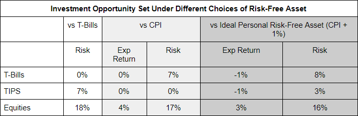
A few things to note on expected return and risk relative to the Ideal Risk-Free Asset:
- Expected Returns are all 1% lower.
- In the rightmost pair of columns, there is no riskless asset available to invest in.
- T-Bills trade places in riskiness with TIPS when we switch the Risk-Free asset from T-Bills to a CPI-linked asset.8
- Equities are less risky, but not significantly so.
The table below shows the portfolio weights which maximize Expected Utility under each assumption of the risk-free asset. Notice that the optimal allocation to equities goes up quite substantially, from 62% to 79%, which is primarily a result of equities being less risky when measured against the Ideal Risk-Free Asset,9 and secondarily a result of the recognition that neither Bills nor TIPS are risk-free. The utility surface is quite flat in the vicinity of optimality, so in practice if actual portfolio weights are off by a bit relative to optimal weights, it isn’t a big concern in terms of overall portfolio quality.10
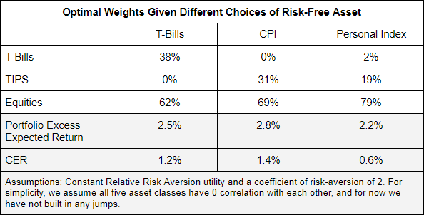
We also see a significant change in the real Certainty-Equivalent Return (CER) of the portfolio. This is primarily driven by the use of our personalized inflation index which we assume will run 1% above CPI, rather than by changes in the optimal weights. Switching from CPI to the assumed Personal Inflation Index decreases the real CER by by 0.8%, the main impact of which would be to lower the investor’s optimal long-term spending policy.11
Conclusion
We’re unlikely to find any real-world assets which meet a reasonable definition of “risk-free” for any given investor, but it turns out that’s OK. Rather than the common practice of trying to construct a pseudo-risk-free asset from a set of available assets which don’t really fit the bill, instead we should simply treat the opportunity set as consisting entirely of risky assets and optimize the real risk-adjusted return of the risky portfolio, using our personalized inflation index as the deflator. In practice, this approach to portfolio construction in the absence of a truly risk-free asset is flexible enough to handle an arbitrarily large number of different assets and a broad range of assumptions about possible outcomes in asset prices, including discontinuous jumps as well as changing risk and correlation patterns over time.
The impact of this change in perspective will depend largely on the starting point of the investor’s asset allocation. For investors with low to moderate risk-aversion – who start off with a high allocation to equities and other patently risky assets – treating the safest assets as being risky (but still the least risky of the available options) is likely to have a modest impact on optimal portfolio weights. But for investors who exhibit a high level of risk-aversion, who are mostly allocated to the safest assets to begin with, explicitly accounting for the risk in government bills and bonds can have a significant impact on their asset allocation. And for almost all investors, regardless of their degree of risk-aversion, moving to an Ideal Risk-Free Asset more closely aligned with per capita income growth will reduce the investor’s risk-adjusted real return and thereby call for a lower long-term spending policy.
Appendix
Here’s what a highly stylized two-asset case looks like when neither asset is risk-free.
- Asset A: the ‘primary’ risk asset with expected return 5% and volatility 18%
- Asset B: the quasi-‘safe’ asset, which is not completely safe
We assume a typical level of risk aversion for which the investor would optimally want the majority of wealth in the primary risk asset.
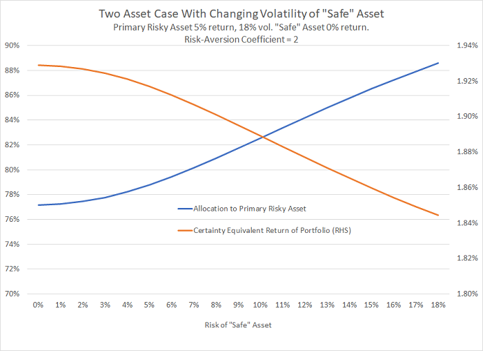
The blue line shows how the optimal allocation to the primary risk asset rises as the quasi-safe asset’s volatility goes up, and the grey line shows how the optimal portfolio’s certainty-equivalent return (CER) drops accordingly. The chart shows that even if the quasi-safe asset has volatility of up to 5%, it doesn’t make much difference to the asset allocation. Also, the acknowledgement that the “safe” asset isn’t so safe hardly impacts CER, from 1.94% down to 1.85%.
Here are the equations for the optimal allocations k* :
kA* = μA – μB + γ(σB2 – σA σB ρ) γ (σA2 + σB2 – 2σA σB ρ)
kB* = 1 – kA*
A is the primary risk asset
B is the quasi safe-asset
k* is the optimal allocation to each asset
μ is expected return
σ is volatility
ρ is correlation of returns between A and B
γ is the Constant Relative Risk Aversion coefficient
- This not is not an offer or solicitation to invest, nor should this be construed in any way as tax advice. Past returns are not indicative of future performance.
We thank Ian Hall and Alan Howard for their comments and suggestions.
- Note that throughout we will use the term “asset” very generally to include any actual or hypothetical collection of returns and risks.
- Here and here are two such services, although neither are particularly targeted to spending patterns of wealthy families.
- Robert Merton and Arun Muralidhar suggest that governments address population retirement needs by issuing securities indexed to national per capita income growth in their idea of Standard-of-Living indexed, Forward-starting, Income only Securities. See SeLFIES: A New Pension Bond and Currency for Retirement (2020).
- And should reflect the currency mix of all forms of your spending.
- While higher income cohorts of the population have seen their income growth dramatically outpace the overall population, this has not always been the case historically, and it might be appropriate for future projections to embrace a degree of reversion to mean. See The U.S. Income Distribution: Trends and
Issues and Per capita personal income in the United States.
- Shiller doesn’t provide per capita income data. Calculations based on 10- to 30-year rolling returns, 125 years from 1891 to 2016. Shiller’s data is available here. Note that, in transforming the risk and return of assets to be relative to the ideal risk-free asset, we do not need to alter the correlations between those assets.
- For a deeper dive into the risk of T-Bills for long-term investors, see our note Back to the Future: Reviving a 19th Century Perspective on Financial Well-Being.
- To a first order approximation, the optimal allocation to the risky asset in the standard Two-Asset model is inversely proportional to the variance of the risky asset. The decrease in equity volatility from 18% to 16% would result in a 25% increase
18%2
16%2
– 1
in the optimal allocation, which is close to the increase we see from 62% to 79%.
- Currently, this is why in our Elm Global Balanced strategies, we effectively treat T-Bills as if they were the lowest-risk asset. This is an issue we regularly revisit.
- See our note Spending Like You’ll Live Forever.